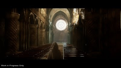
Work in progress style guide (missing a few models and textures)
I'm putting the finishing touches to week 8's lesson for my fxphd class, but like all good tutors obviously I'm a bit further forward than that. The above is a quick render using only the normal map versions for Mike as a rough style guide for approval on the lighting and overall 'look'. Its often hard for non 3d types to 'see'in advance what you mean, especially when there are only minimal guides as to what is needed. So I produced 6 stills from the opening shot along with 2 video version of the complete shot (faked using just some not so clever camera transforms in after fx, quick, dirty and perfec tfor approvals). One video version (which I'm sorry i can't show yet) is half speed as I thought it mad the shot more emotional. Although this is technically steppping on Mikes toes a wee bit, I think he realised a while back I spit ideas out like a canon and he's free to dump any he dislikes, or all of them. Mikes a real pro and a very nice guy and understand I dont take any crits in a work enviroment to heart and storm off crying in my coffee.
The style was approved inside of an hour,so I'msafe to continue in this vein, although the half speed is still open to debate.
This of course is where the 'magic' of our creativity comes in along with always knowing what an assset will look like before you hit render. In a similar way that i alwasy know what effect a brush will give while sculpting. So I'm hoping to have the class version ready and final in 3dmx pretty soonish (this week) before staring on the entire maya /Renderman version. This of course assumes that I dont manage to screw up renderman as the scene is currently very heavy (10 million polys in the viewport) and funnily enough apps dont usualy like that sort of thing. The use of poxies wont save alot as things need to be lined up so precisly that I find the only reliable way is by eye. (Lining up by eye gets a bum rap sometimes but I find it often just as accurate , as welll as more versatile than other methods. Plus it also helps to add a nice human element to the art.)
The tombs are missing for the shot above, is the altar screen and the gargoyles (Those I probably will use as proxys before I blow up 3d max and maya with over work as those will double the polys in the viewport just about). Also a few bits at the back dont have their textures yet as the sharp eyed will have noticed...why? because I couldn't be arsed to redo those bits after being on at it for a few hours.
So its hopefuly got a quite stylistic almost old style matte painting look to it. Bright lighting while it would make the cathedral look nicee, would also not fit the shot or its content too well. As I've said many times, ad no doubt will many more. Its not about making our models looks as nice as possible, its about fitting the shot. There is no 'I' in team, but there is however a 'stop being an egotistical bastard only concerned with there own work' in it lol.
Anyways, I'm of to try and forget that I'm waiting like a kid at xmas for my rails set up (matte box arrrived on saturday) to arrive for my DSLR rig upgrade. Wife is starting to get a wee bit sick of a house full of camera equipment, chroma key rigs , massive reflectors and car camera rigs (which is ironic as I dont drive lol) and a shit load of other things. Just do me a favour and dont mentin tripods as they have taken over every cupboard and shelf.